Flex 与 Grid 学习
📚 Web 学习目录
🚀 HTML学习 - 📝 CSS学习 - 🚗 Flex 与 Grid 学习 - 🔦 JavaScript学习 - 🎉 JavaScript 高级
Flex学习
Flex 是 Flexible Box 的缩写,意为”弹性布局”,用来为盒状模型提供最大的灵活性。
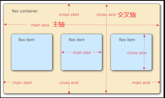
Flex容器默认存在的两条轴
水平主轴(main axis)垂直的交叉轴(cross axis)
Flex容器中的每个单元块被称之为 flex item,每个项目占据的主轴的空间为 (main size), 占据的交叉轴的空间为 (cross size)。
当然、水平和垂直方法的轴也可以互换。
Flex容器
我们需要指定一个容器(任何一个容器都可以)作为为 flex 布局
1 | .container { |
字面意思: 块级元素和行内元素指定。
注意:
当时设置 flex 布局之后,子元素的 float、clear、vertical-align 的属性将会失效。
容器上的属性
以下六种属性设置在容器上:
flex-directionflex-wrapflex-flowjustify-contentalign-itemsalign-content
一个简单的Html:
1 | <style> |
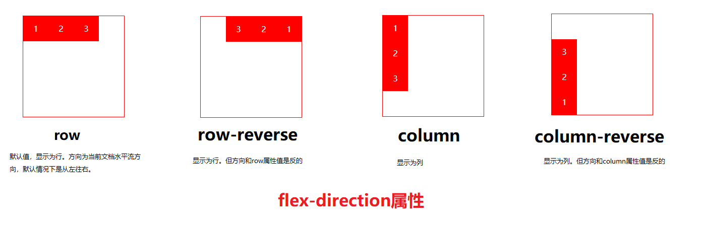
flex-direction
用来控制子项整体布局方向,是从左往右还是从右往左,是从上往,下还是从下往上。
| 取值 | 含义 |
|---|---|
row | 默认值,显示为行。方向为当前文档水平流方向,默认情况下是从左往右。 |
row-reverse | 显示为行。但方向和row属性值是反的 |
column | 显示为列。 |
column-reverse | 显示为列。但方向和column属性值是反的 |
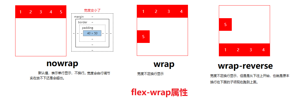
flex-wrap
用来控制子项整体单行显示还是换行显示。
| 取值 | 含义 |
|---|---|
nowrap | 默认值,表示单行显示,不换行。 |
wrap | 宽度不足换行显示 |
wrap-reverse | 宽度不足换行显示,但是是从下往上开始,也就是原本换行在下面的子项现在跑到上面。 |
flex-flow
flex-flow属性是flex- direction和flex wrap的缩写,表示flex布局的flow流动特性。
第一个值表示方向,第二个值表示换行,中间用空格隔开。
1 | .container { |
默认值为: row nowrap、作用不大、分开来写更好
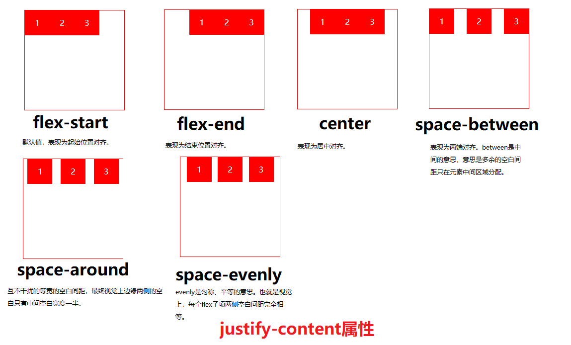
justify-content
决定了主轴方向上子项的对齐和分布方式。
| 取值 | 含义 |
|---|---|
flex-start | 默认值,表现为起始位置对齐。 |
flex-end | 表现为结束位置对齐。 |
center | 表现为居中对齐。 |
space-between | 表现为两端对齐。between是中间的意思,意思是多余的空白间距只在元素中间区域分配。 |
space-around | around是环绕的意思,意思是每个flex子项两侧都环绕互不干扰的等宽的空白间距,最终视觉上边缘两侧的空白只有中间空白宽度一半。 |
space-evenly | evenly是匀称、平等的意思。也就是视觉上,每个flex子项两侧空白间距完全相等。 |
建立在主轴为水平方向时测试,即 flex-direction: row
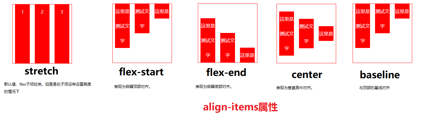
align-items
align-items中的items指的就是flex子项们,因此align-items指的就是flex子项们相对于flex容器在交叉轴方向上的对齐方式。
| 取值 | 含义 |
|---|---|
stretch | 默认值,flex子项拉伸。 |
flex-start | 表现为容器顶部对齐。 |
flex-end | 表现为容器底部对齐。 |
center | 表现为垂直居中对齐。 |
baseline | 与顶部的基线对齐 |
简单的Html代码
1 | <style> |
align-content
align- content可以看成和justify-content是相似且对立的属性,如果所有flex子项只有一行,则align-content属性是没有任何效果的。
有点类似align-items、但是针对多行
| 取值 | 含义 |
|---|---|
stretch | 默认值。每一行flex 子元素都等比例拉伸。例如,如果共两行flex子元素,则每-行拉伸高度是50%。 |
flex-start | 表现为起始位置对齐。 |
flex-end | 表现为结束位置对齐。 |
center | 表现为居中对齐。 |
space-between | 表现为两端对齐。 |
space-around | 每一行元素上下都享有独立不重叠的空白空间。 |
space-evenly | 每一行元素都完全上下等分。 |
子项上的属性
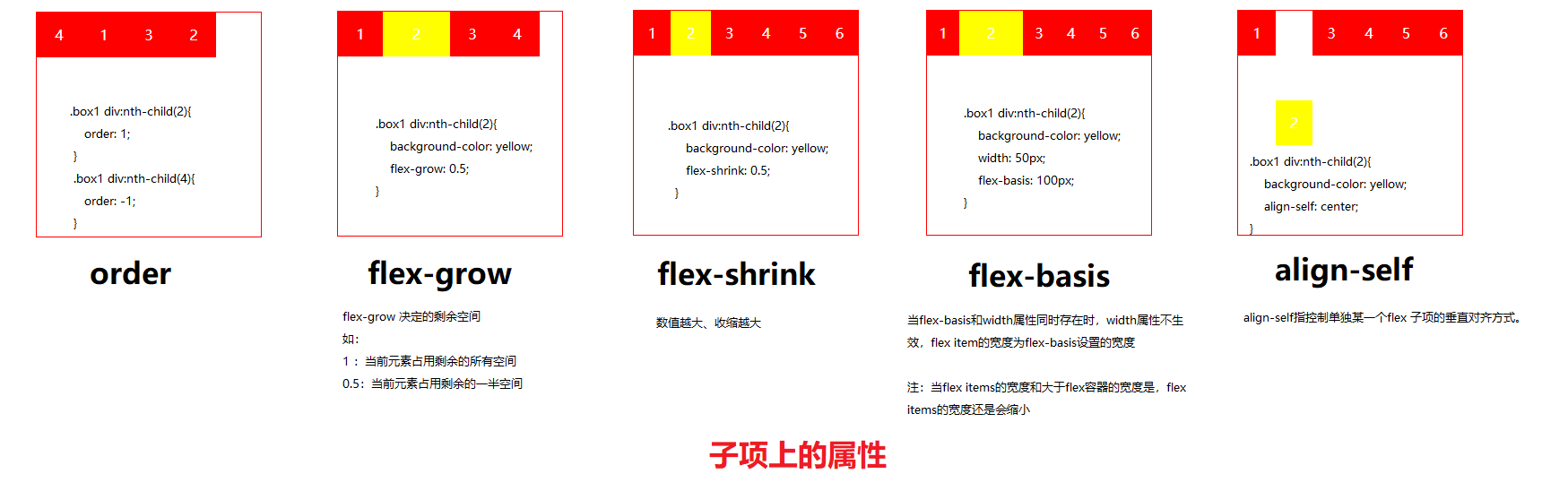
以下六种属性设置在 item 项目上
orderflex-basisflex-growflex-shrinkflexalign-self
| 取值 | 含义 |
|---|---|
order | 可以通过设置order改变某一个flex子项的排序位置。所有flex子项的默认order属性值是0。 |
flex-grow | 属性中的grow是扩展的意思,扩展的就是flex子项所占据的宽度,扩展所侵占的空间就是除去元素外的剩余的空白间隙。默认值为0。 |
flex-shrink | 属性中的shrink是”收缩”的意思,flex-shrink主 要处理当flex容器空间不足时候,单个元素的收缩比例。默认值是1。 |
flex-basis | flex-basis定义了在分配剩余空间之前元素的默认大小。 |
flex | flex属性是flex-grow, flex- shrink和flex-basis的缩写。flex 的默认值是 0 1 auto。 flex:1 就相当于 flex-grow: 1 |
align-self | align-self指控制单独某一个flex子项的垂直对齐方式。 |
Grid学习
Gird是css中最强大的布局系统,应用于二维布局,可以同时处理行和列,可以通过将网格css规则应用于父元素(网格容器)和该元素的子元素(网格子项)来使用网格布局。
Grid布局是一个二维的布局方法,纵横两个方向总是同时存在。
1 | .container { |
Grid容器上的属性
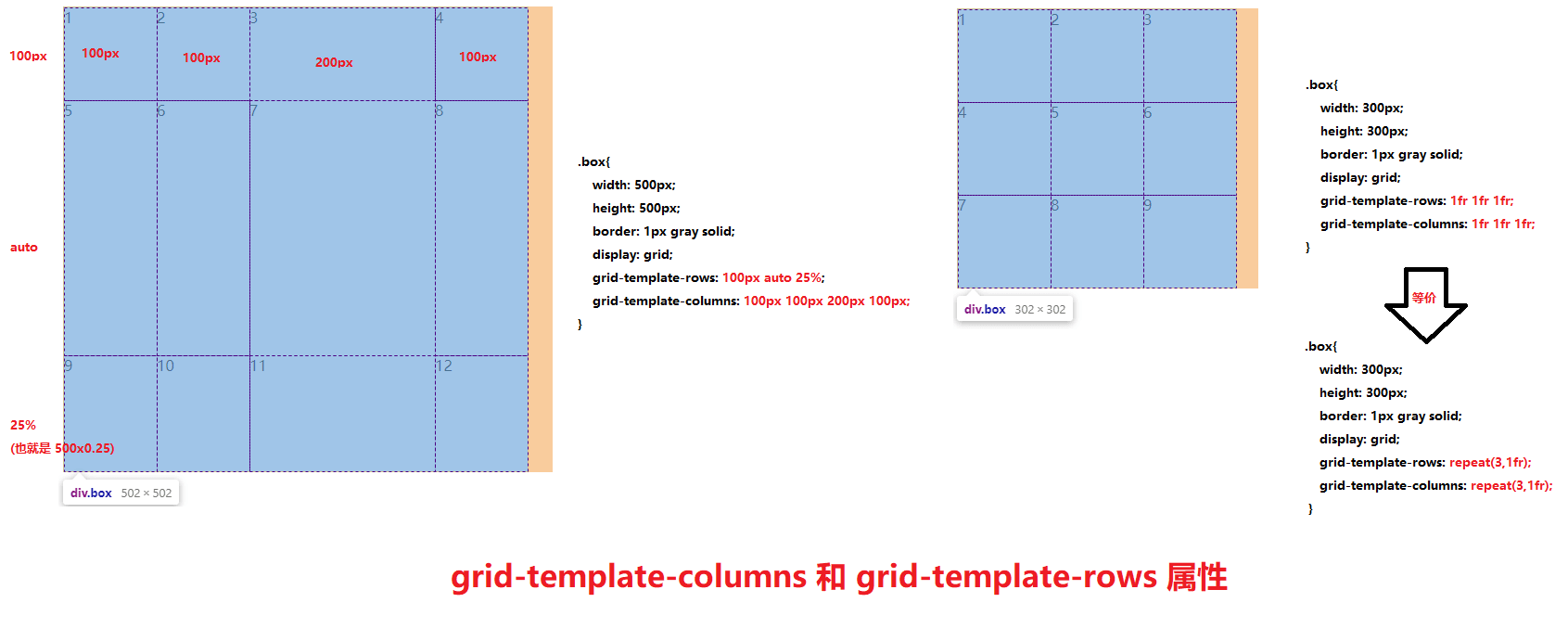
grid-template-columns和grid-template-rows
对网格进行横纵划分,形成二维布局。单位可以是像素,百分比,自适应以及 fr单位(网格剩余空间比例单位)。
有时候,我们网格的划分是很规律的,如果需要添加多个横纵网格时,可以利用 repeat()语法 进行简化操作。
一个三行四列模型:
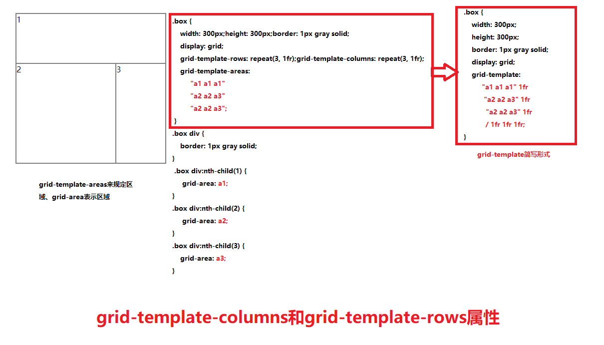
grid-template-areas和grid-template
area是区域的意思, grid-template-areas就是给我们]的网格划分区域的。此时grid子项只要使用grid-area属性指定其隶属于那个区。grid-template是grid- template-rows , grid-template-columns和grid-template-areas属性的缩写。
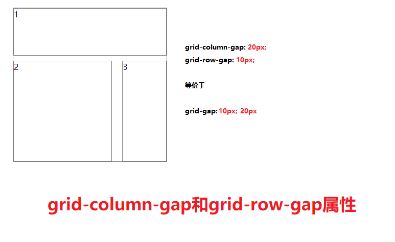
grid-column-gap和grid-row-gap
grid-column-gap和grid-row-gap属性用来定义网格中网格间隙的尺寸。
CSS grid-gap属性是grid-row-gap和grid-column-gap属性的缩写。
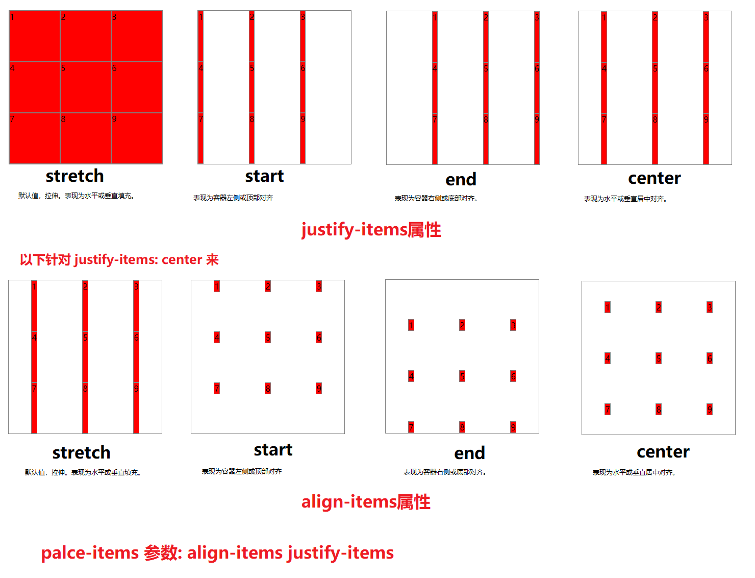
justify-items和align-items
设置单元格内容的位置
justify-items指定了网格元素的水平呈现方式 ,是水平拉伸显示 ,还是左中右对齐。align-items指定了网格元素的垂直呈现方式,是垂直拉伸显示,还是上中下对齐。place-items可以让align-items和justify-items属性写在单个声明中。place-items: align-content justify-content
1 | <style> |
| 取值 | 含义 |
|---|---|
stretch | 默认值,拉伸。表现为水平或垂直填充。 |
start | 表现为容器左侧或顶部对齐。 |
end | 表现为容器右侧或底部对齐。 |
center | 表现为水平或垂直居中对齐。 |
justify-content和allign-content
整个内容区域在容器里面的位置
justify-content指定了网格元素的水平分布方式。align-content指定了网格元素的垂直分布方式。place-content可以让align-content和justify-content属性写在一个CSS声明中。place-conent: justify-content align-content
| 取值 | 含义 |
|---|---|
stretch | 默认值,拉伸。表现为水平或垂直填充。 |
start | 表现为容器左侧或顶部对齐。 |
end | 表现为容器右侧或底部对齐。 |
center | 表现为水平或垂直居中对齐。 |
space-between | 表现为两端对齐。 |
space-around | 享有独立不重叠的空白空间。 |
space-evenly | 平均分配空白空间 |
1 | <style> |
子项上的属性
| 取值 | 含义 |
|---|---|
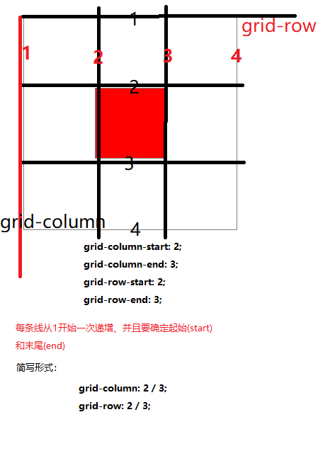
grid-column-start | 水平方向上占据的起始位置。 |
grid-column-end | 水平方向上占据的结束位置。(span属性) 如:grid-colum-end: span 2; 表示从起始位置开始占用2个位置 |
grid-row-start | 垂直方向上占据的起始位置。 |
grid-row-end | 垂直方向上占据的结束位置。( span属性) |
grid-column | grid-column-start + grid-column-end的缩写、中间需要 /。 如 :grid-column: grid-column-start / grid-column-end |
grid-row | grid-row-start + grid-row-end的缩写。同上书写方式 |
grid-area | 表示当前网格所占用的区域,名字和位置两种表示方法。如: grid-area:3/2/4/4; /*第一个值是水平的起始位置,第二个值是垂直的起始位置,三个值是水平的结束位置,第四个值是垂直的结束位置*/ |
justify-self | 单个网格元素的水平对齐方式。 |
align-self | 单个网格元素的垂直对齐方式。 |
place-self | align-self和justify-self的缩写。place-self: align-self justify-self |
1 | <style> |
参考:
 支付宝
支付宝- 微信